One of the features I was really proud of having in Journey was our dynamic UI colors. I have never really seen anyone else do this.
I think of it as automagical branding and styling.
(Journey was an SMB presentation tool, you could use it to share sales proposals and such. As such the branding of the Journey was really important — it needed to look appropriate for your brand.)
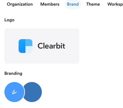
When you sign up for Journey, we ask for your domain. We then take that domain and extract the logo and primary colour from brandfetch.com.
We then had a little algorithm that derived a secondary color. We then figured out complementary colors, essentially giving us a little palette.
Now obviously we used these colors to make Journeys look "on-brand" but we also took it a step further and used it to restyle every button and accent color within the Journey Editor too, here is a simple example — note how the highlighted tab background is complementary to the logo of the user: